Epark

Overview
We were tasked to create a better and more transparent public parking system to improve drivers experience and public inspection.
Details
Role: UX/UI Designer
Client: Private Investor
Duration: 3 mon, Sep 2018
Tools: Adobe XD, Excel
Problem
The public parking system on most cities of Brazil rely on pen and paper to function. This causes traffic jams, loss of public money, worst levels of pollution and terrible experience to the driver.
The goal of this project was to present a functional MVP of a solution to a small City Hall in Brazil, showing that by transforming the analogical process to a digital one, the city would improve tax collection and citizen satisfaction while reducing pollution levels.
Process
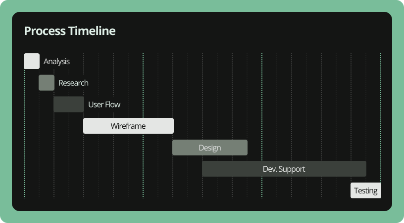
It all begins at the Analysis, where we understand the problem and plan for the project. We estimate schedules and create a timeline that will guide us throughout the project. I’ll talk about each step below.
The Dev. Support happens through all the development phase. It can be anything. Something that pass by our refinement, some problematic icons, changing a component the make delivery fast, etc. Anything they need to finish it.
And the Testing at the end, is more like a QA. We test the product to find any inconsistence with the documentation or business requirement. We also test for UI problems that may (will) happen.
Research
The investor arrived with a full presentation to sell the idea and 2 pieces of information caught our attention.
1: 35% of traffic jams are caused by people looking for a place to park their car;
2: Cities loses up to 30% of the parking taxes due to irregular parking and bad inspection;
We didn’t have much time for a great research but we managed to talk to a few people. We simply asked them “What is the worst part of parking in the street?” Most of the answers was:
1: To find a place do park;
2: To renew the tax card;
The answers seemed to play in line with the data. People have difficulties finding a place to park, causing traffic jam (1). Also, people hate to leave the place they were, so they don’t renew the tax card because the odds of getting caught by a inspector is low. Which leads to lost of taxes income (2). We have our two big problems to solve.
User Flow
The first thing we did was to list all features the investor asked and the ones we imagined would better the experience. This list became lots of flows very similar to the one below. Some were more complex with two or three arrows for a item.
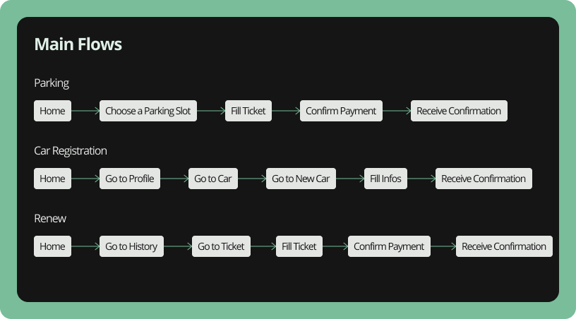
This is faster to validate then a wireframe. So we’ve made some iterations and choose the better one at the end.
Wireframe
Is great to have a user flow to begin the wireframes because we already draw a first sketch for the screen flow. Is faster to work with that ready. But even with that, the Wireframe phase is one of the longest in many projects.
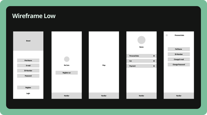
That’s because we normally find lots of gaps in these flows after drawing a screen. Add to that the fact that we test with some people, so there’s more adjustments to make.
And this can go on forever. One of the best part of having a timeline is that we can force ourselves to stop at some point and accept that it was the best we could do in the moment.
Product
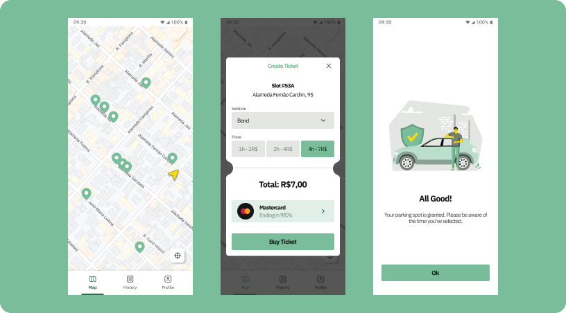
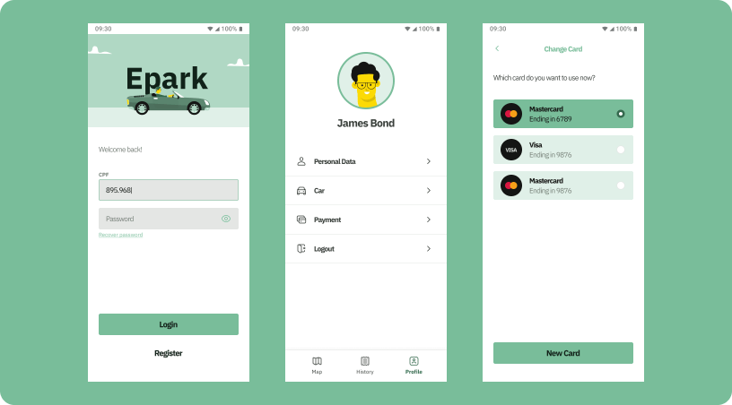
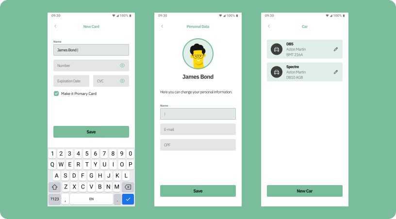
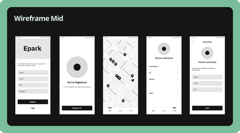
After the Wireframe Mid is validated we start to polish the UI, the phase we call “design” in the timeline. For this project, we created simple tokens like fonts hierarchy, spaces and colors. Which lead us to simple components like buttons and inputs.
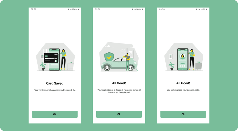
There was no time nor need for a complete design system, so we went with this simple UI Kit. For the illustration, we used a open source collection and edited to match the app design. Same with the icons.
